Aj's Lite Bites
Local café visual identityAJ's Lite Bites, a small café, asked for a visual identity design to suit the needs of their business. I really enjoyed working on this project because it involved working with a range of print media. From business cards to a pop-up banner, each piece of print media was uniquely designed to match the client's specification.
Talking with the client was the first step towards making a design brief. One of the important elements was colour. The client requested an mono colour scheme consisting of warm colours, in particular the colour orange. It was vital for the brand to appear professional and friendly to draw in customers from nearby businesses and locals.
Logo
Going for a minimal approach, a simple coffee cup was created to be the forefront of the logo design. The floating style and the bite mark is a visual representation of the café name.
Orange was used to draw attention to particular elements and highlight information. The design uses a dark background to create a bold effect.
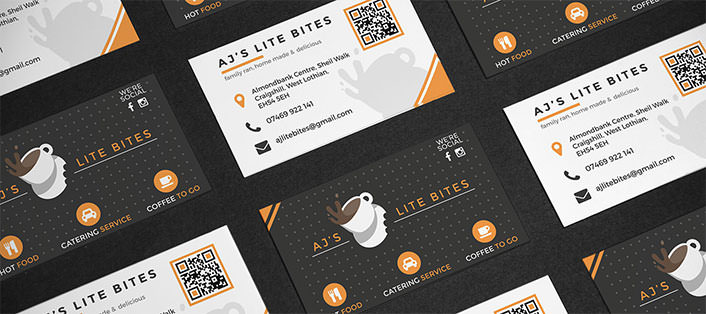
It was super important for the logo design to be adaptable. Part of the brief included different print media for the café. Some of this would be handed out to customers - in the form of loyalty and business cards.


Conclusion
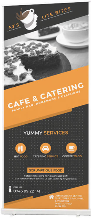
The client was very happy with the work and gave positive feedback. The pop-up banner in particular was a highlight for client. The café was situated inside a business building and the pop-up banner gave the café area a lot of life.
Introducing a loyalty card scheme, the client gave an incentive for repeat business. Business cards were used as a form of advertisement throughout the local area.