Magma Machine
Graphic Design PartnershipMagma Machine was a small graphic and digital design partnership co-founded by myself and my partner. First established during college it was a fun business idea to get a taste of the working environment and gain experience.
I learned a huge amount from running Magma Machine, such as client communication and working with the Adobe Creative Suite. It was only due to education commitments did Magma Machine have to close.
While deciding on a name for our business I listened to the podcast series, Adventures In Design hosted by Mark Brickey. The podcast itself covers a wide range of topics relating to graphic design. From this we soon came up with the name 'Magma Machine' as we wanted to stand out amongst other creative design businesses.
Branding
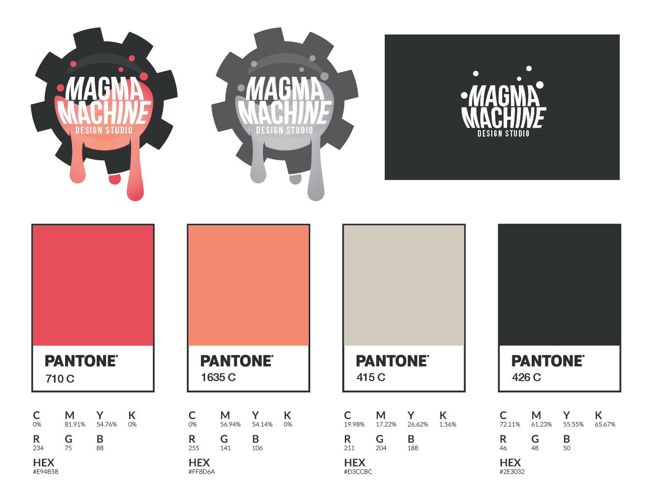
With magma in the name we naturally chose a warm colour scheme. Putting it against a dark backdrop highlighted the magma effect. The cog represents the 'machine' part of the design and brings all of the elements together.
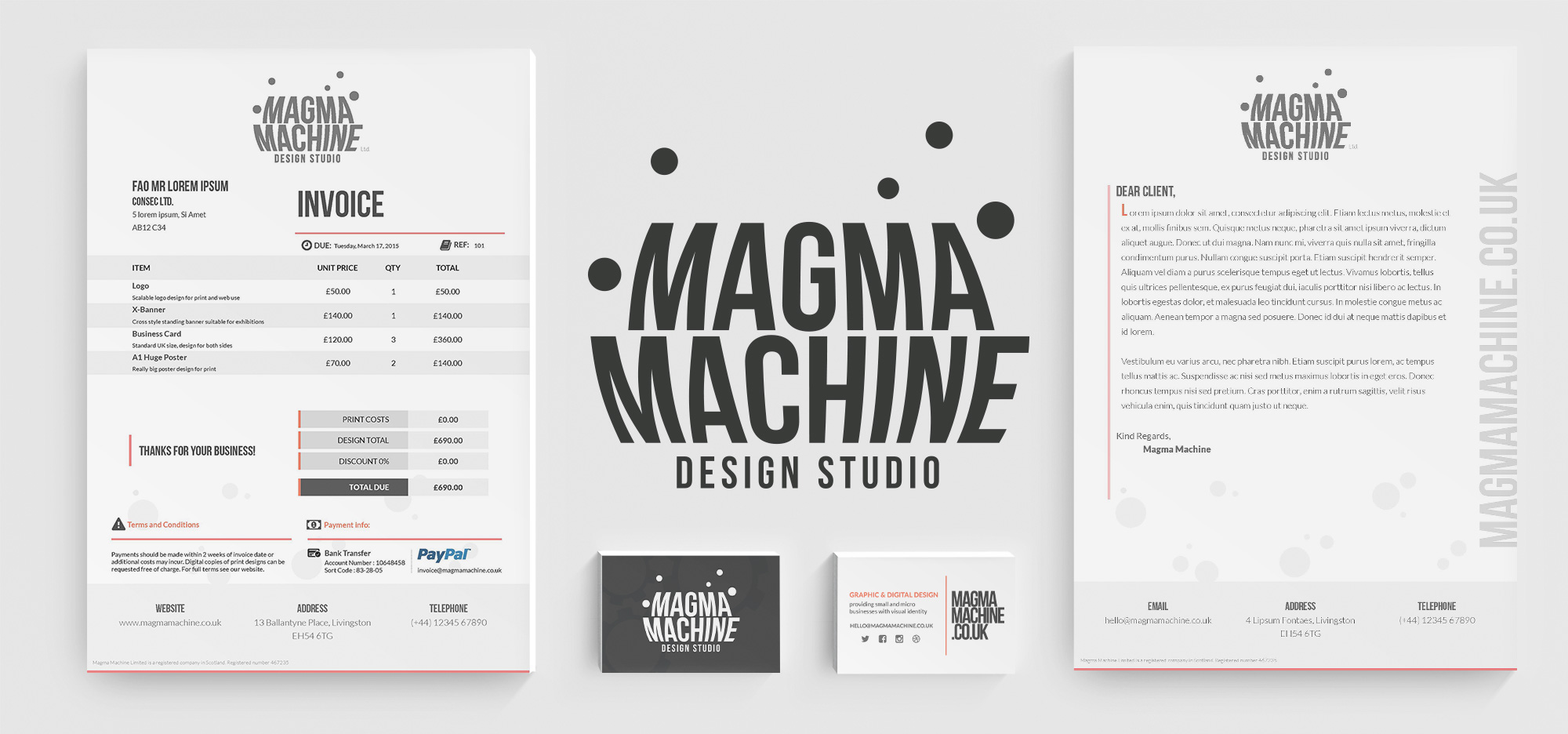
The brand design of Magma Machine is to showcase to potential clients that we weren't afraid to work with unique projects and think outside the box. A variant of the logo design was developed for when the illustration logo design was not suitable e.g. business cards, files, etc.
We took a minimalist approach for the brand identity and brand assets. This was achieved through the use of white space and modern typefaces. Colours were used to determine key elements and features and draw attention to certain elements.
I took note of the shape, colours and simplistic details of the Nostromo uniform badge. The idea was to keep the shape in-line with a patch that could potentially be used on a space uniform. I purposely researched 80's sci-fi for the logo as I felt it was important to step away from modern space designs to differentiate from existing designs.