Pixel Rain
Website ConceptAn ongoing concept space that I use to refine my skills. Pixel Rain is a fictional design company targeting businesses to offer design services to. The design specification is for a minimum landing page for both desktop and mobile.
Discovery Phase
At this stage its all about asking questions and finding out the requirements for the project. This can cover things like business/user requirements, limitations, etc. I used an online whiteboarding technique to gather the requirements and bring all the information together.
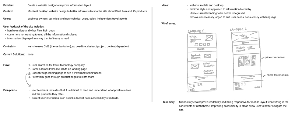
Approach/Planning
Using the information gathered in the discovery phase, a plan is put in place to solve the problem. In this case, the main pain point is the landing page and user engagement.
Ideation is important at this phase; brainstorming ideas, user flows, etc. all help to come up with potential solutions. Comparing the impact and the effort for these ideas helps to find the most optimal solution.
Results/Design
Referencing the last two phases, this phase is about considering the best solution. Drawing up wireframes helps to give a rough idea of how the solution may look without the distraction of styling/branding. Typically I draw wireframes using pen and paper first before creating them on Figma.
Once these wireframes are approved - I put together mock-ups to give a realistic impression of the solution. Depending on the requirements, prototypes can be used for further user testing at this phase. Check out the prototype I made for my WinterBank project.
Visual Identity
Included in the project was to include visual identity work. This included logo design, branding colours, typography, etc. Although this falls into Graphic Design, I was able to utilise my experience from Magma Machine for this part in the project.
Logo Design
Branding Colours
Design System
I created a small design system for Pixel Rain to maintain consistency throughout the project. The components are made up of nested components to reduce the time it takes for any changes. By using variants in the component design, I can easily update the style of the button without the need to recreate or change the instance. You can see an example of button components below.
I used Tailwind’s font sizes as a basis for font sizes. Using Tailwind CSS as a basis would be beneficial if being passed to front-end development. Text fields and other inputs I loosely based on Material UI's specifications.