WinterBank
Mobile PrototypeWinter Bank was created from a design challenge to create a mobile concept for a fake banking app. The prototype was originally created using InVision. Due to InVision services ending in 2024, I moved the prototype to Figma.
It was during this time I re-worked the whole app. The original was created many years ago and the app needed some love and care.
Main inspiration for this project was mainly existing bank apps. I also did research into concept work for bank related apps to help fuel ideas.
Interested in the Winter Bank prototype?
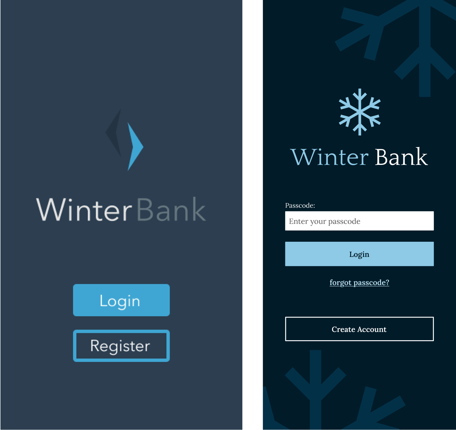
Logo Design
The original logo was very abstract - it was based on icicles to keep with the ‘winter’ theme. However, looking at it again recently, it felt too harsh. I changed it to a simple snowflake shape to convey soft elegance.
Typography was updated too. Serif fonts can provide a formal look to a design and I wanted to move away from the informal look of the original. With this in mind I went with Quattrocento for the logo font and headings.

Colour
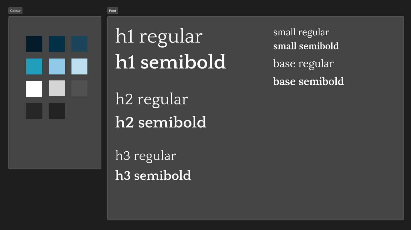
It’s safe to say some of the colours used in the original has a few issues. It doesn’t meet WCAG colour contrast standards for accessibility, part of the logo blends into the background, etc. It needed some work.
One of the first things I did was creating more contrast between the background and the logo. I stuck with blues to keep on theme, but used them in a way to ensure accessibility standards were met.
Landing Screen
Again, original design has similar issues to those mentioned above. Here I’ve included elements a user may expect to see on a log in page, including text fields (including label for better accessibility), forgot passcode link, etc. Wording was updated, and I reused the logo shape to create a background texture.
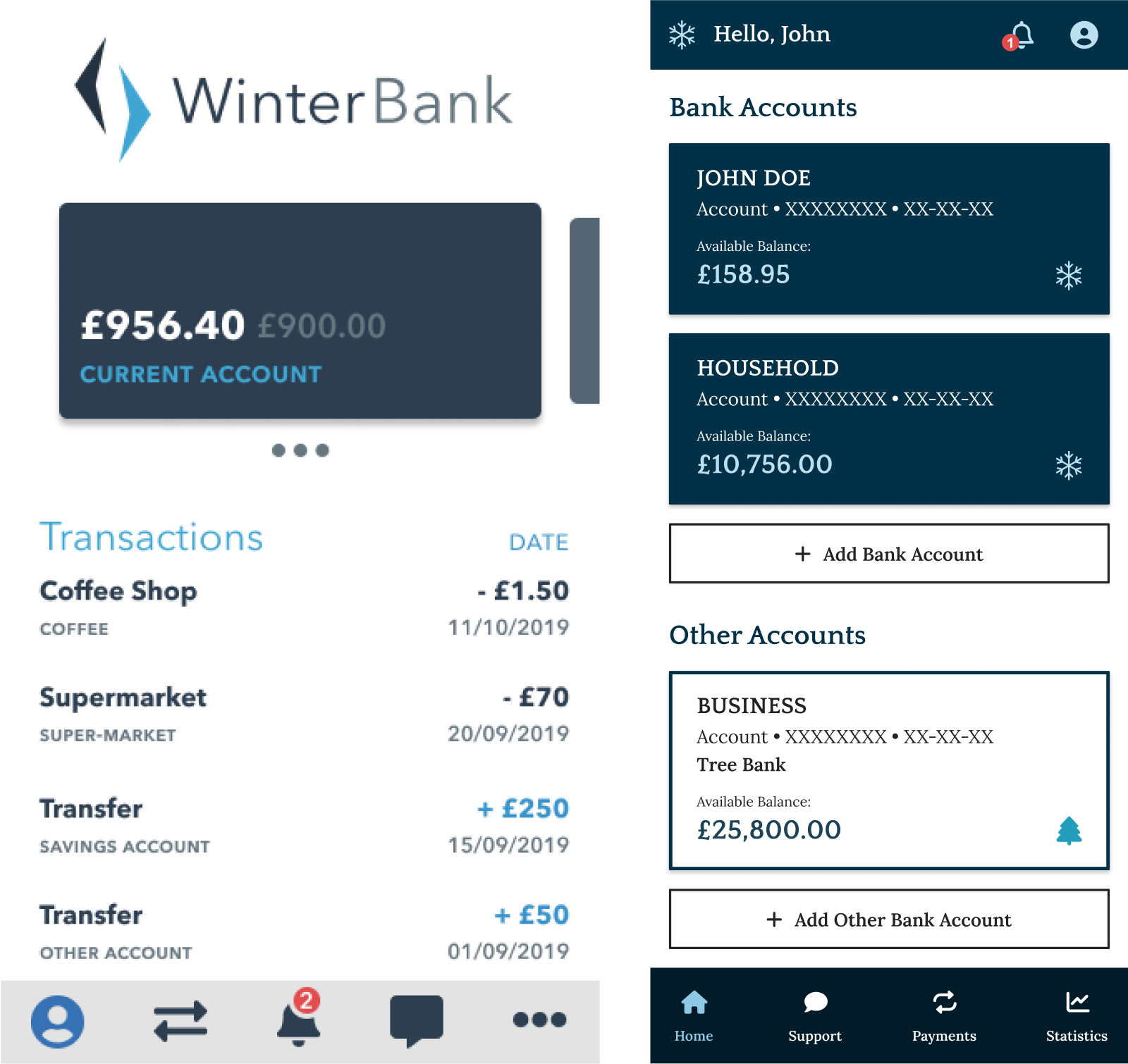
Home Screen
A lot of changes were made here that ultimately changed the whole flow from the original. In my original concept, the user would be able to swipe to change which account was being used. When looking at this again, I asked myself things like; how would a user know to swipe here; does the concept make sense, how to better navigation, etc.
I changed the whole integration, no more swiping between ‘accounts’, user can simply just click into account and see the relevant information. Updated the contrast, created a design system to maintain consistency and much more.
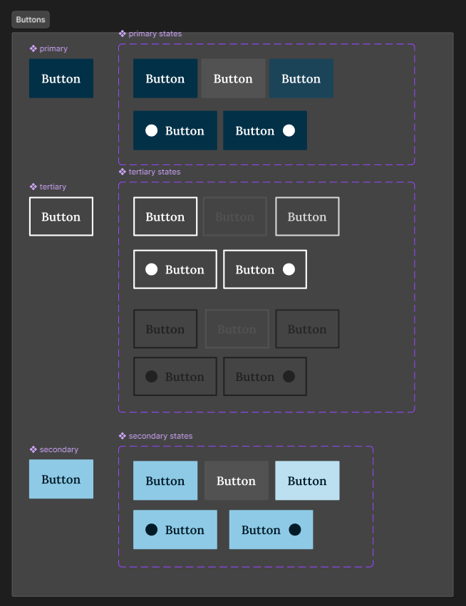
Design System
As previously mentioned, I created a small design system for Winter Bank. I was able to reuse the components I had created to maintain consistency throughout the app. I only had to make changes in one place and overall made the whole process so much smoother. It’s good practice too.
I used auto layout and nested components throughout the design system. The parent component being on the left and on the right different states/variations. Doing this meant I could change the parent component and those changes would be applied to the variants, e.g. rounded corners, etc.
The circle shapes are placeholders for icons - the parent has these hidden by default. By adding a property to the states to ‘show icon’ I can then turn this property ‘on’ or ‘off’ to display an icon if required. These properties can be accessed whenever I use the variant components.